This Summer's Hottest New Release: The Woman At The Park
- Stephanie Cabral
- Feb 23, 2021
- 3 min read

Updated: Feb 19, 2023
Have you ever looked at the poster for your favorite movie and was left in awe? I'm sure you have and many other people feel this way too. You know at least one person who has a movie poster hanging on their wall and if you don't then the person is probably you.
Researching movie posters over the decades, it's clear that there is not one formula to create a great movie poster. Some have many elements and effects, while others are very minimalist. There is no wrong way to do it.


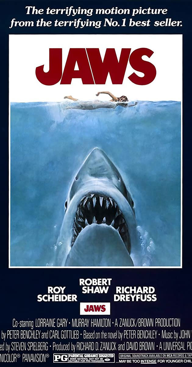


A final movie poster goes through the creative process multiple times (if not more) in order to get the image that will resonate with the audience. I decided to utilize everything that I've learned so far about visual design to create a fake movie poster.
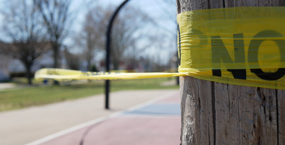
I started by looking at the photos I took over this past summer, practicing my photography skills. I had many wide shots of locations, but decided on the first photo below because of the spatial depth that the walkway creates. The slight darkness of the shot makes it feel ominous, and I felt that would work well with a mystery or thriller film. I was then able to find items from a variety of photos that fit the mysterious theme, including caution tape, a shadowy figure, and a storm-colored sky.


After compiling the images together, and playing around with size and distortion, this is the finished product:

Midline, Balance, and Asymmetry
The path acts as a visual midline to the piece, separating the graphic elements. In this case, the midline does not help facilitate symmetry within the piece, although it might seem like it with the trees and the gazebo in the background. However, the midline does accentuate the balanced asymmetry of the composition.
Spatial Depth
There are many elements in place here that give this poster depth. First, there is a clear fore, middle, and background. The foreground contains the biggest, clearest objects (the bench, the lamp post, and the caution tape wrapped around the post. The middle ground has the shadowy figure (which is not as clear) and the second row of trees. The background is the buildings, the gazebo, and the sky.
The pathway is a tilted plane that guides the eye to the back of the image. The way it rescinds into the background also adds to the depth of the composition.
There were a few things I had to layer within this piece. First, I removed the sky and placed the layer of orange sky underneath. The shadowy figure was a simple cut and paste. The caution tape I had to distort it in order to make it look like it was realistically wrapped around the tree and lamp post. I then used the excess to elongate the ripped strands.
There's movement within the piece in two spots. First, the shadow is walking, as shown by the staggered footsteps. What gives more movement, however, is the flyaway pieces of tape. I wanted it to look like she had just ripped it and walked through.
Typography
I didn't want to do anything too fancy here to distract from the rest of the piece. I chose a san serif, block font because it gives off a stronger feeling than curly or swirled fonts. I chose white to contrast the darkness of the pathway. My original intention was to skew the font to make it look like it was written on the path, but I had trouble figuring that out, so I opted to place each word closer to the bottom edge of each block.
I placed the words in a slanted pattern to mimic the path that the woman walked. I tried to make the words in the foreground bigger than those in the middle ground, but I'm realizing now the size difference isn't big enough.
All in all, this was a fun project, but only once I knew what my vision was. For me, it can be incredibly frustrating just to come up with an idea. But once that's all figured out, then the fun stuff can begin.


Comments