I've Got Your Post-Pandemic Trip Planned
- Stephanie Cabral
- Mar 15, 2021
- 3 min read

Updated: Feb 20, 2023
If there is one thing I miss deeply since the pandemic started, it's traveling. It's been a goal of mine to take at least two trips each year: a domestic one and an international one. I often go through my photo albums from my trips when I'm feeling nostalgic, and that has especially been the case during this past year. The last trip I went on was in October 2019, when I visited friends in Berlin and Budapest. While I loved both cities, I really enjoyed Budapest and would easily go again in the future.
Using all of the visual design concepts that I have learned in the past seven weeks, I created a travel brochure, because what better way to reminisce?
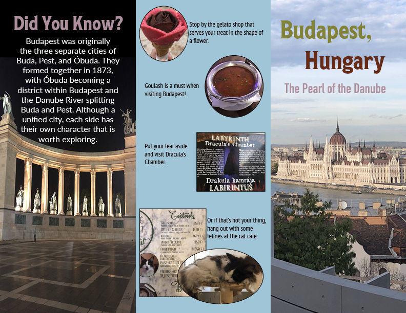
The back, middle, and front sections
The inside of the brochure
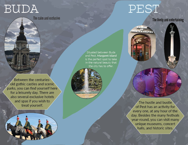
My main inspiration was this photo that I took on the plane flying into Budapest of the two sides of the city, Margaret Island, and of course, the Danube. I thought it would be interesting to play on the split of the river and potentially use the river as a midline for the inside of the brochure.

I was originally toying with the idea of Buda being on the left, the Danube in the middle, and Pest on the right. But, that's very typical and not original, so I decided to shift the river to run diagonally across the sections in order to switch perspectives.
However, even after planning out where the text and pictures would go, the middle still looked empty. Do I fill it with facts about the Danube? Do I shrink it so it doesn't take up as much room? It seemed like such a waste of space and it threw off the composition.


To be honest, I don't know why I initially didn't include Margaret Island in the first couple of plans, but I put it back in because it is part of Budapest and has a history of its own. Also, it's kinda hard to miss, unless you're me and forget about it.
The front and back were simple designs for me to come up with, but the middle section was difficult. It acts as the connection piece between the front and the inside, so I felt it was more important than the front and back. It couldn't feel out of place.
I ignored what I knew about Budapest for a second and tried to look at the inside as someone who is reading this for the first time. I realized that the map of the city would be confusing to people if they didn't know that Budapest was once two cities. To facilitate that connection, I added a brief "Did you know?" blurb to provide context. (Fun fact, I found out Budapest was actually two cities split by the river while I was walking on the bridge that connected the two. Yes, I did a double-take).
Some of the other considerations I had:
Spatial Depth
I had to make the background first using pieces from the photo mixed with my own shape creations. Instead of just plopping pictures in, I put them in an oval frame to give it a refined look. I also overlapped a couple of pictures, which of course was then overlaid on the background. The pictures for the front and back are taken at an angle that adds major depth, so alterations for those were not needed.
Topography
The buildings and aesthetic of Budapest are gothic, so I wanted to bring that into the font, specifically with the front and any headers. Having everything in gothic would be overkill so I used another font that I like to call modern gothic, which appears softer but still carries the weight of centuries-old type. Also considering most of those fonts are difficult to read in a smaller size, I had to switch to something more legible.
The Grid
Every plane has a grid in which information can be organized so it is easier to read. For a brochure, information is split into three columns and split horizontally into perfect blocks. Pictures, text, and graphics don't spill into other sections. Having the background cover the entire inside, and the river running diagonally across breaks the grid. Information is still clearly displayed and easy to read, so sometimes it's good to break the rules.
Color
I wanted to keep the colors simple and play off of what the pictures had. I used black, dark gray, and white as my neutral colors and used the blue and green from the aerial photo as my bright colors. I originally wanted to incorporate red and green from Hungary's flag but it did not look good at all. Instead, I grabbed the gold accent from Budapest's flag and used that for the text boxes and the front.


Comments