A Beginner’s Digital Take on Mondrian
- Stephanie Cabral
- Feb 1, 2021
- 3 min read

Updated: Feb 19, 2023
Photoshop scares the living daylights out of me, I’ll admit that. It’s complex, overwhelming, and hard to understand. Art is the same for me. Most renowned pieces are just shapes and colors, and while others can see jealousy or elation, I just see, well, yellow circles and thin lines. How do artists/designers create these pieces?
As with most things that are scary, I don’t know much about art or Photoshop. However, once I combined the two and delved into the design process, things started clicking.
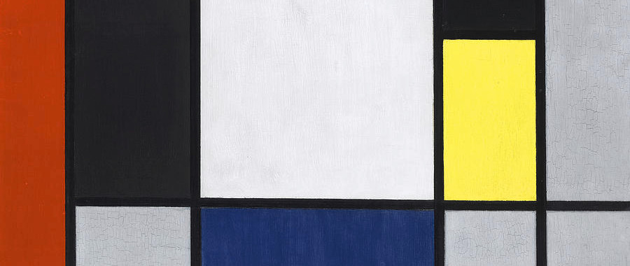
Piet Mondrian (1872-1944) was an abstract painter most known for the style compositions shown below. The simplistic design stands out and is rememberable for its distinct style. It may just be thick black lines with red, blue, yellow, and gray squares, but something about it is catchy to the eye.


Line, Shape, and Figure/Ground
The most basic elements of design are lines, shapes, and the space that these figures do or do not take (commonly referred to as positive and negative). It’s obvious here that there are black lines creating rectangles and squares, but if you look closely there is more depth.
The black lines that run toward the edge of the composition don’t actually touch the edge. Normally our minds would understand that just because the page stops, it doesn’t mean the lines do. They can keep extending to create more squares. But for many in this series, the lines stop. What this means I’m not quite sure, but it makes your mind stop what it normally does and say “wait…this doesn’t continue.”
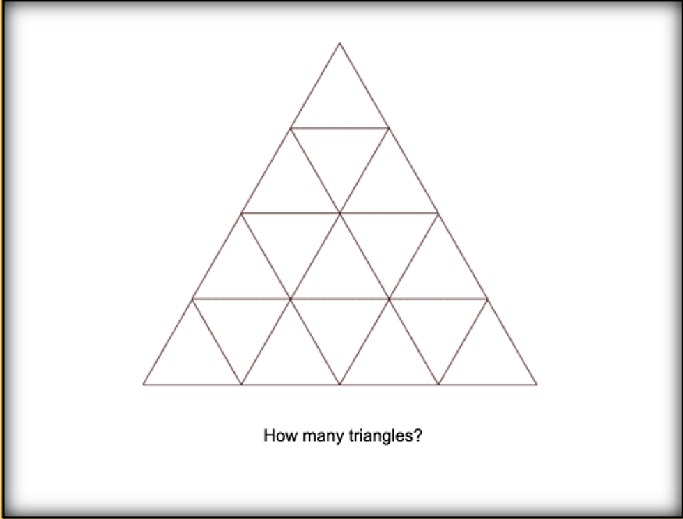
The use of the simple square and rectangle turns complex when you realize that two of the rectangles together are a square, and when those are connected with adjacent ones, they make a bigger square. It’s like those visual math puzzles that ask how many triangles are in a figure.
In terms of positive and negative space, I think it would come naturally for someone to say that there is no negative space because there are white squares. But what if it’s not? What if Mondrian drew a bunch of perpendicular lines and colored in a few squares but the background is actually white?
Emphasis and Hierarchy
Immediately your eye is drawn to the biggest or smallest square because that’s just how humans perceive stimuli. We like orderly things so our minds will process in a hierarchy, whether it’s smallest to the largest, foreground to background, first to third, etc.
In addition, Mondrian places emphasis on certain rectangles/squares by using a bold color, such as red in the first painting above. He wanted you to look at that first- and it is the most striking part of the painting even though there are other bright colors in the composition as well.
Okay But, What About Photoshop?
Now understanding some basic concepts of design, I took Mondrian’s style and create my own version of his series in Photoshop. After some hours of tutorials and clicking later, this is what I came up with:
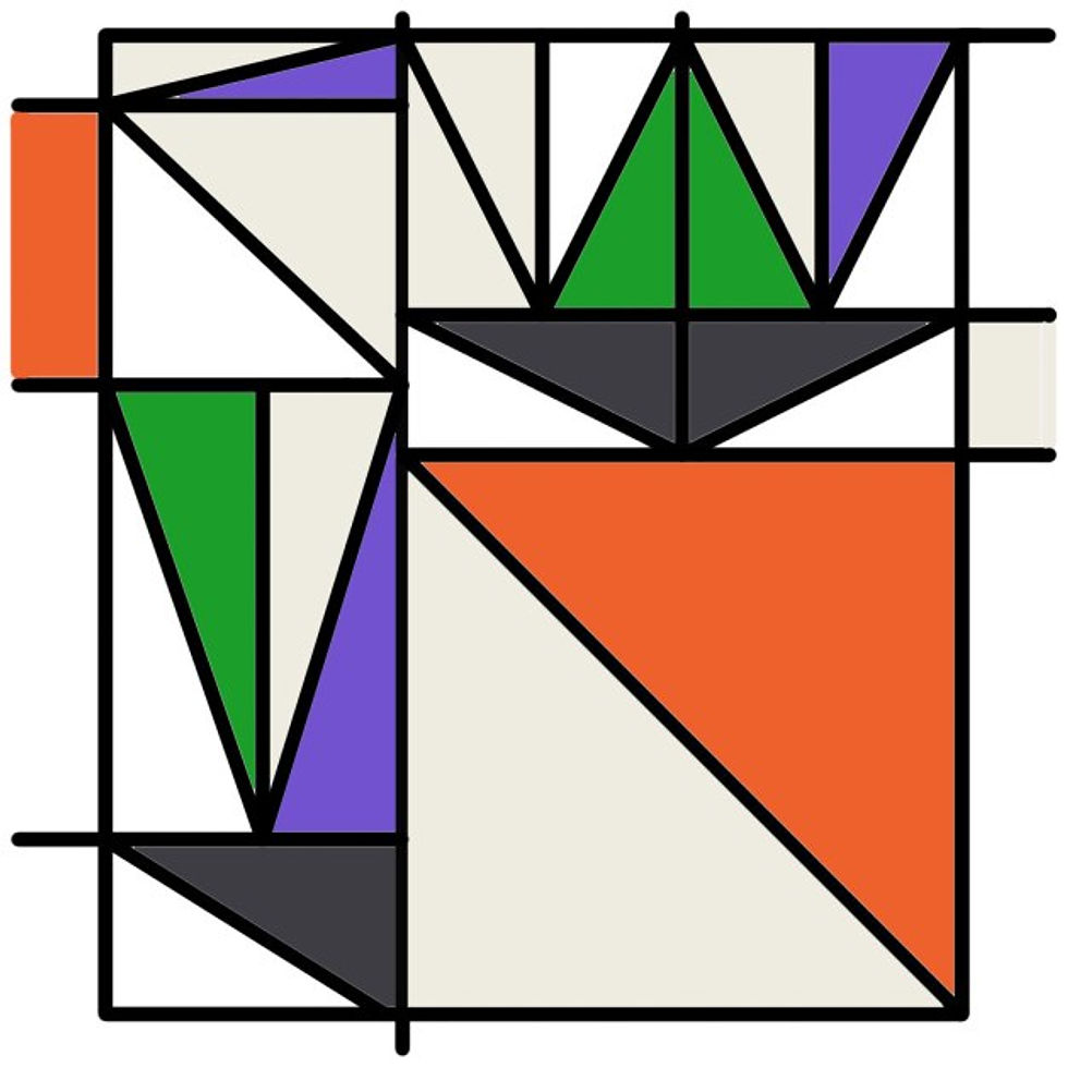
Some notable steps I took:
Using secondary colors instead of primary
Using triangles as the shape, which also creates rectangles and squares
Lines not reaching the edge of the image
Emphasis on the biggest triangle using orange
Is it Mondrian-worthy? I’d say not. Would he be proud? I’d like to think so.
References:
Boulton, Mark. “Whitespace.” A List Apart, 9 Jan. 2007, alistapart.com/article/whitespace/.
Fontana, Anthony. Intro to Composition. PowerPoint.
Landa, Robin. Graphic Design Solutions. Boston, MA, Cengage, 2019.
Programming Design Systems. “Basic Shapes and Relationships.” Runemadsen.com, 2020, printingcode.runemadsen.com/lecture-form/.


Comments